Over the past few months, I’ve been coordinating the preparation of a formal User experience (UX) study for the Multimedia usability project. Basically, it means observing how “real” users interact with the Wikimedia Commons in order to improve it. Videos of the testing have now been published in order to share them with the community.
We reached out to some UX firms and published a Call for proposals in February. Several firms submitted proposals; after serious consideration, we chose to work with gotomedia, a San Francisco-based firm that seemed to align best with our goals & values.
The study was planned to take place in March, but was postponed because the prototype was not ready. In the meantime, we asked some of our co-workers to test it in order to uncover the most obvious flaws & bugs.
Goals & testing conditions
A few weeks ago, the actual testing eventually took place. We tested ten users: five locally in San Francisco, and five remotely within the US. We considered conducting similar testing abroad, in order to identify language-specific issues; but in the end, it turned out that we wouldn’t learn a lot by simply replicating the same test script.

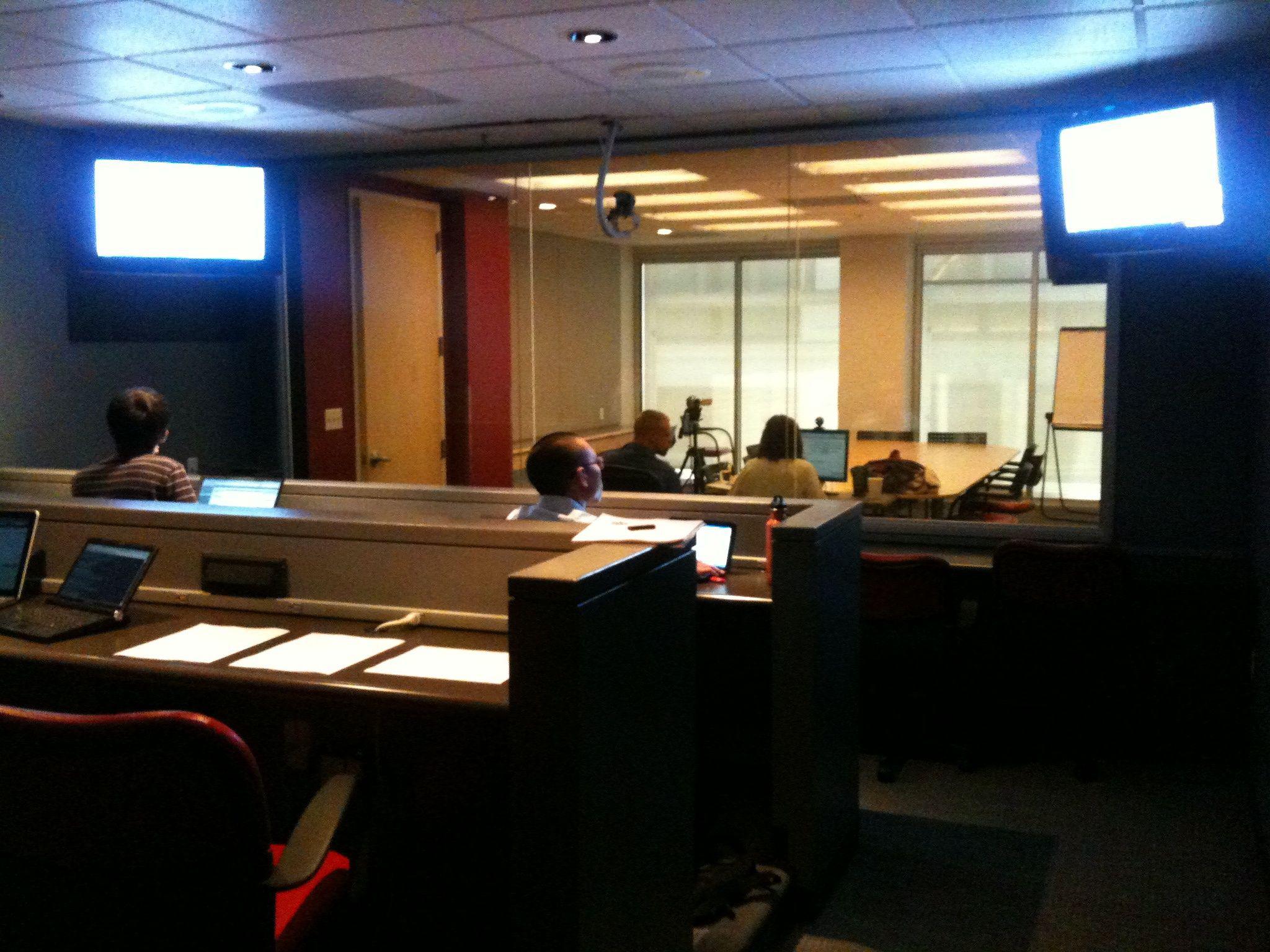
The observation room at the testing facility; the testing is happening in the background, behind the semi-transparent glass. (Usability testing. With Fleischman/gotomedia by Neil Kandalgaonkar, under CC-By-NC, from flickr.)
Multilingualism on Commons (and Wikimedia websites generally) is a huge piece of work that deserves dedicated efforts, and dedicated UX studies. The main reason for which we decided to hold the testing halfway through the project, and not at its very beginning, was that we could test both the current upload interface, and our prototype.
On the one hand, during our preliminary research phase, we identified a large number of issues with the current interface; but we still needed to formally record the user experience and validate our preliminary conclusions. On the other hand, we wanted to do a reality-check with our prototype, to see if the direction we had chosen was appropriate, and to identify areas of improvement.
Highlight videos
The testing sessions went pretty smoothly. The gotomedia folks did a fantastic job at preparing the “highlight videos” in time for our conferences in Gdańsk (WikiSym & Wikimania). The audiences really liked them, although we didn’t have time to show all of them.
Highlight videos are edited summaries of the main findings of the study. In our case, we have three highlight videos: one about the testing of the current interface on Commons, one about the testing of the prototype, and the last one about how we could improve the prototype.
Long story short: the current interface is a nightmare, and the prototype is way better, even if there are some minor things to improve. The good news is, all the items to improve were already planned features at the time of testing, and they have either already been added, or will be before the upload wizard is released.
Namely, one of the main remaining issues is the fact that users don’t really understand copyright and free licenses. That’s why we’ve been working on a licensing tutorial at the same time, to be released jointly with the new upload wizard.
See for yourself
The highlight videos are now available on Wikimedia Commons; per our agreement with gotomedia, all the videos were released under the Creative Commons Attribution - Share alike 3.0 license.
In the tradition of Wikipedia’s Neutral point of view policy, we’ll try to upload the unedited videos to Commons as well, in order to let the community draw their own conclusions.
If you would like to draw our attention to things we’ve missed, or even edit your own highlight videos yourself, you are warmly invited to do so. You can watch the highlight videos below (streamed from Commons) or directly on Commons.
The links to Commons are available below if you want to download the video files on your computer. Your feedback and comments are much welcome.
Current interface highlight video
See the file on Commons or download the OGV video (4m11s, 29.89 MB).
Prototype highlight video
See the file on Commons or download the OGV video (5m32s, 35.43 MB)
Room for improvement highlight video
See the file on Commons or download the OGV video (3m51s, 23.02 MB)