42,812. That’s the number of files currently residing in my “photos” folder. They span seven years of photography, three continents, and an evolving mix of taste, experience and equipment. This mosaic marks the inauguration of the gallery section of this site, where I’ll be sharing the pictures I like the most.
To be fair, many of the photos sitting in my hard drive are similar to each other. I often take series of nearly-identical pictures to increase the likelihood of getting at least one good shot out of the lot. This can be, for example, when taking photos in low light without stabilization, or when photographing a moving subject like a flying plane, a running squirrel or a babbling politician. There’s also, in the lot, quite a bit of actual duplicates that exist in different formats.
Nonetheless, that’s a fair amount of photos, and I’m slowly sorting, rating, tagging, describing, geolocating and uploading them all (mostly to Wikimedia Commons). One thing I’ve noticed that helps me process my photos is to have a routine, like dedicating a few hours every week to that activity. It can be a pretty intense and exhausting task, though, and I’m probably more likely to stick to it if I do it for shorter periods of time but more regularly.
Therefore, I’ve opened a dedicated gallery section on this site, where I’ll be posting some of my photos a few times a week (ideally, once a day, but I’ll start with a less ambitious goal).
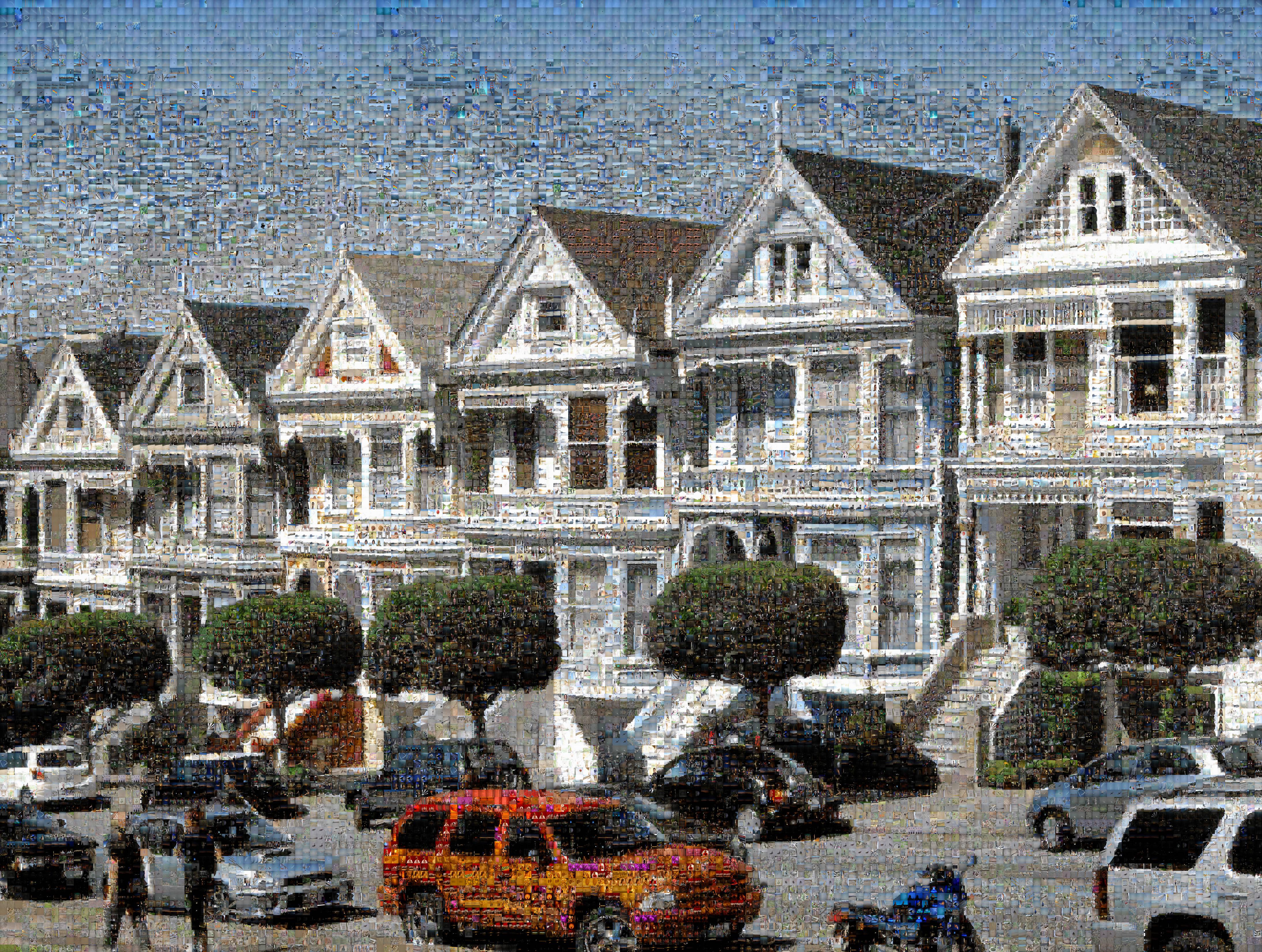
To inaugurate this gallery, it seemed fitting to start with a representative sample of my body of work so far. I’ve therefore created a photographic mosaic, i.e. a photograph made of thousands of smaller photographs, picked for their color and composition, and assembled to reconstruct the pattern and color of a larger picture.

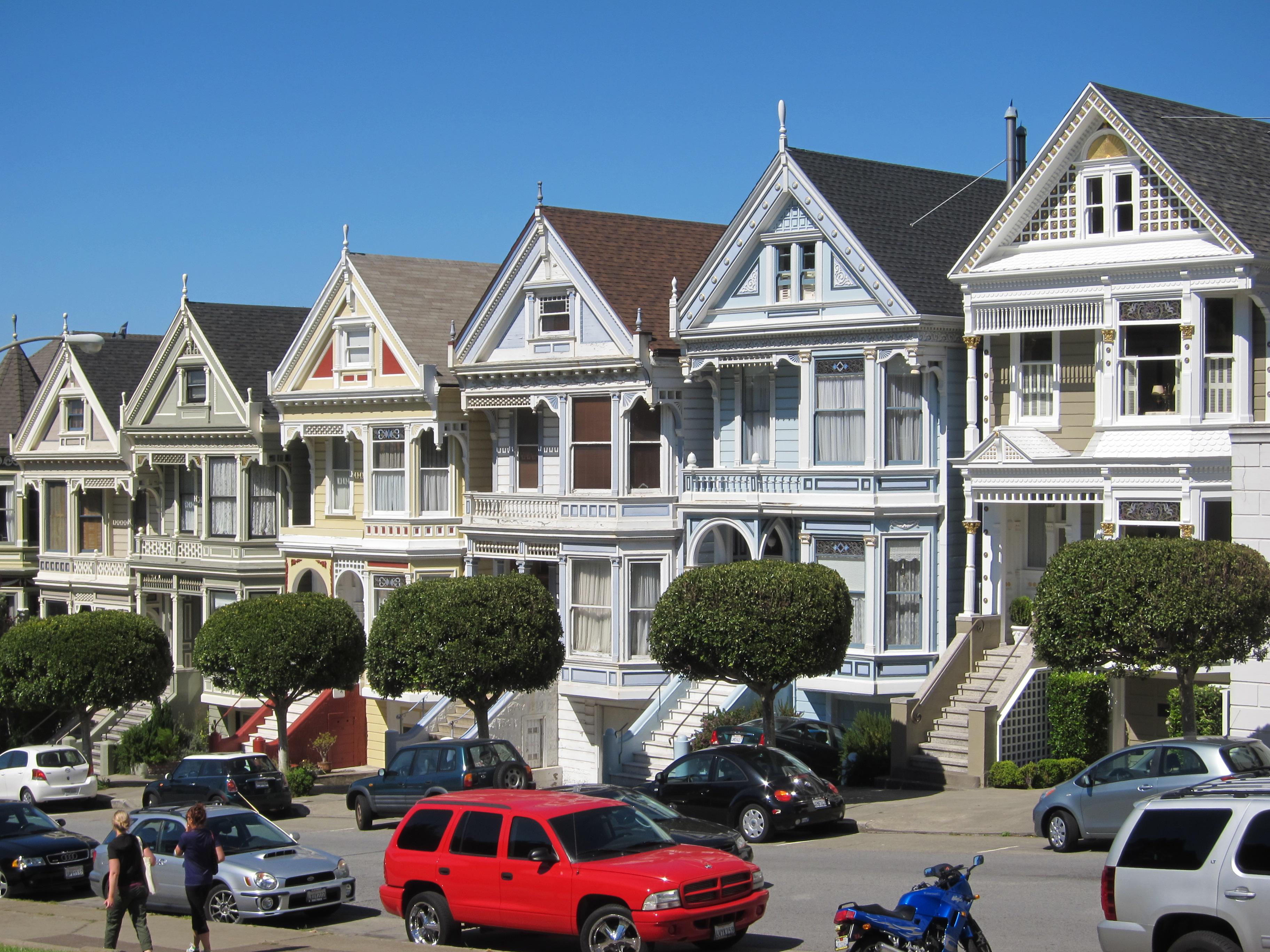
The mosaic above shows the “Painted Ladies“: famous Victorian houses near Alamo Square, in San Francisco. It’s composed of 22,059 of my other pictures, automatically picked by a program from the pool of 42,812. I used the excellent (and open-source) Metapixel tool to prepare the images and assemble the mosaic. Below is the original photo I took in June 2010.

Original picture, taken with a point-and-shoot camera.
The original photo is quite ordinary, and yet I really like the mosaic that was generated from it. The mosaic almost transforms the picture into a pointillism painting, which makes it much more interesting. The mosaic’s colors appear washed out compared to some of the saturated colors of the original, but it actually contributes to the painting appearance.
It’s my first time making a photo mosaic, so I’ve experimented a bit with the settings but didn’t dive into them too much. For example, the small pictures composing the mosaic are all squares, regardless of their original aspect ratio (usually 3:2 or 2:3, or 4:3 for my older photos), which means that nearly all of them are squeezed. It’s not too much of a problem in this case, but I’ll want to retry assembling mosaics while conserving the images’ ratio. There’s a minimal distance of 50 between identical images, but several items of a series may be closer. I’ve also slightly favored chrominance over luminance in the color matching algorithm.
I’ve experimented with different pattern images, i.e. the source image whose pattern is reconstructed from the smaller ones. I like some of the other resulting mosaics, so I’ve included them below. I have a few others, but today I’ll stick to the San Francisco theme.
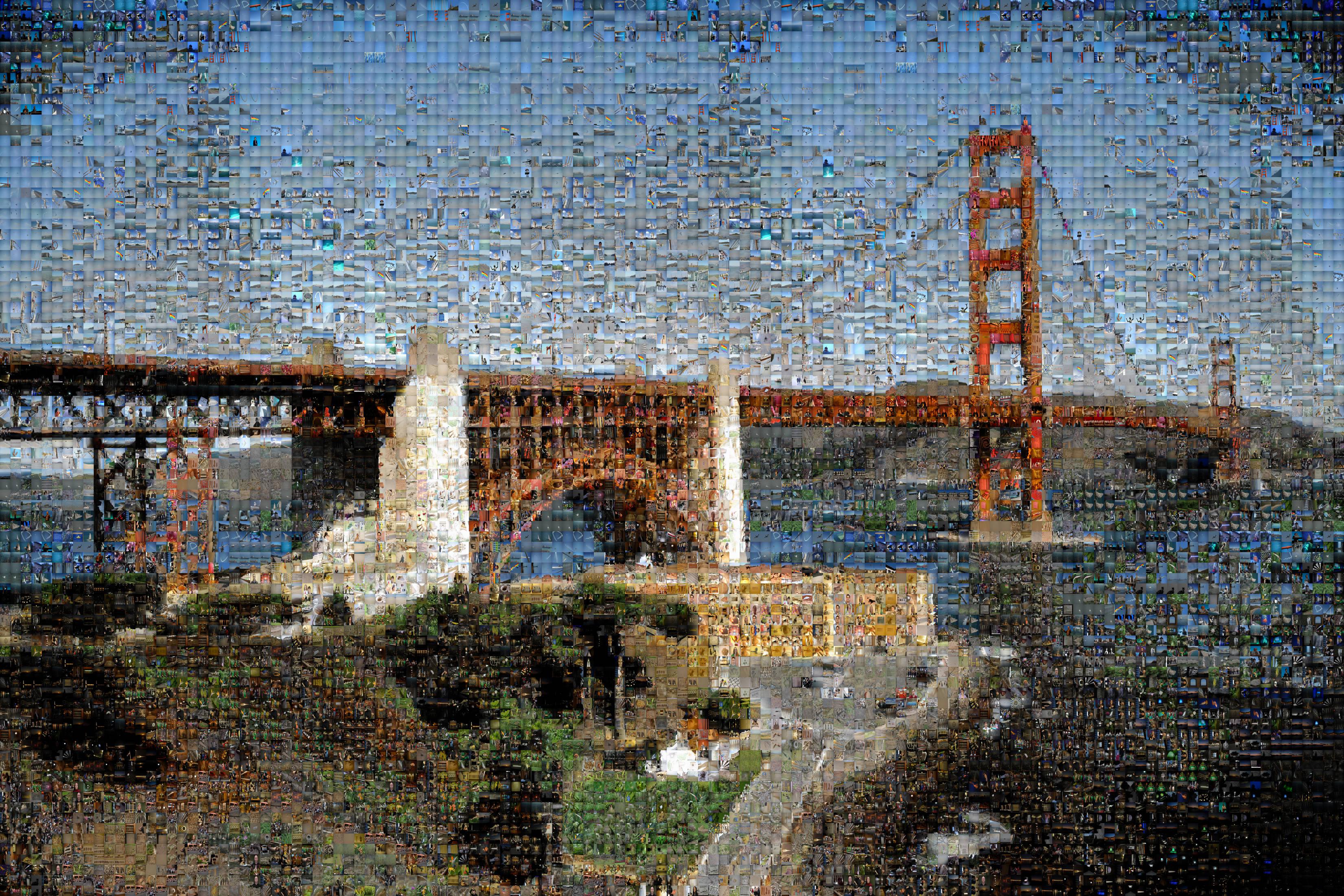
Below is a mosaic showing the famous Golden Gate Bridge, seen from San Francisco’s Presidio. It’s composed of 11,094 pictures. The original photo actually made it to Wikimedia Commons a mere five weeks after it was taken.

The results aren’t as good on images with gradients, but this one is still pretty nice.
This mosaic is a bit more vibrant than the one of the Painted Ladies, because the original image is more saturated. I like the original because it has strong red-green-blue components, but the strong blue mostly disappears in the mosaic. The original also contains more color gradients, which don’t look so nice in the mosaic; the whole sky is pretty noisy, and the artistic vignetting is exacerbated, particularly in the lower right corner.
Part of the sky’s noise is due to the minimal distance of 50 images between two identical ones: this causes groups of images to be repeated in waves that become noticeable from afar. It’s possible to increase the minimal distance, however that drastically increases the processing time needed to create the mosaic.
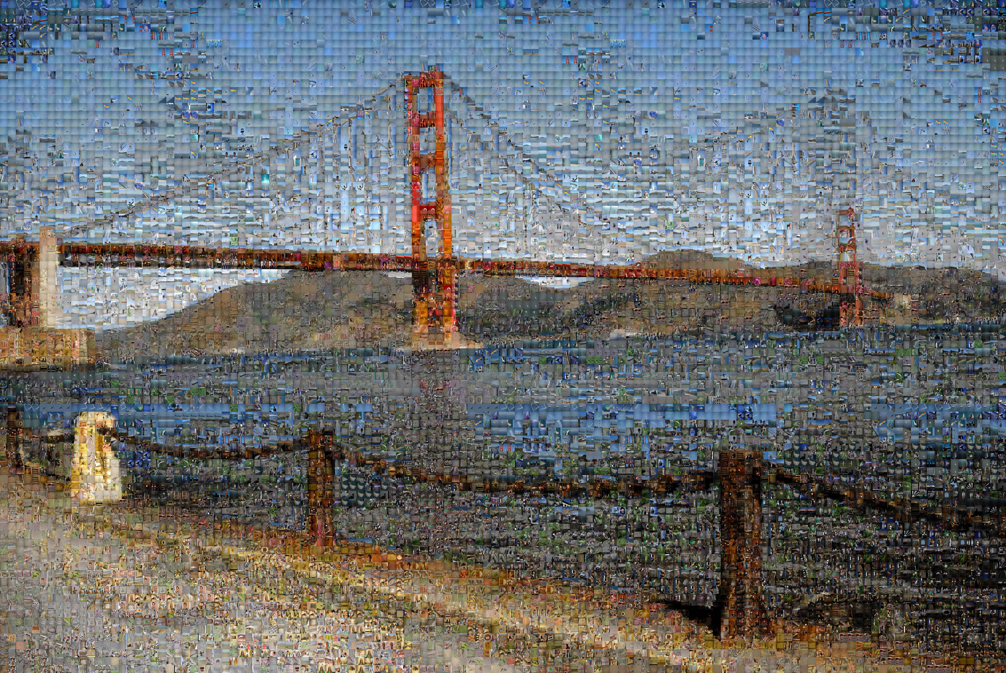
The third and last mosaic (below) shows the same issues of gradients and repeating waves in the sky and sea; you can compare with the original. However, it highlights something that isn’t obvious in the previous mosaic, and that’s the impressive quality of Metapixel’s matching algorithm, which makes it possible to make out the bridge’s suspension system, and even individual cables. I’m also quite fond of the grain added by the mosaic to the rusty chain and pillars in the foreground.

It’s possible to make out the bridge’s suspension system and individual cables, thanks to Metapixel’s matching algorithm.
To wrap up: I like the additional potential of creativity provided by mosaics as a medium, and I’ll probably play with them again in the future. But for now, after this introduction, I’ll start posting individual photos, many of which have been hinted at in the mosaics. I’ve quite enjoyed rediscovering forgotten pictures as I was exploring the super-high resolution versions of the mosaics, and I hope you’ll enjoy them as well, as they start popping up in this gallery.